A Superfresh Refresh
Brewing since 2015, Bira 91 ushered in a fresh wave of flavorful beers for India, and has a rapidly increasing global footprint today. Their flagship product—Bira 91 White with its freshness and flavour-fullness set a new benchmark for craft beer and became the de facto face of the parent brand (Bira 91). Over time as the product portfolio diversified, Bira 91 White suffered from lack of sharp differentiation and distinct recall of newer product lines.
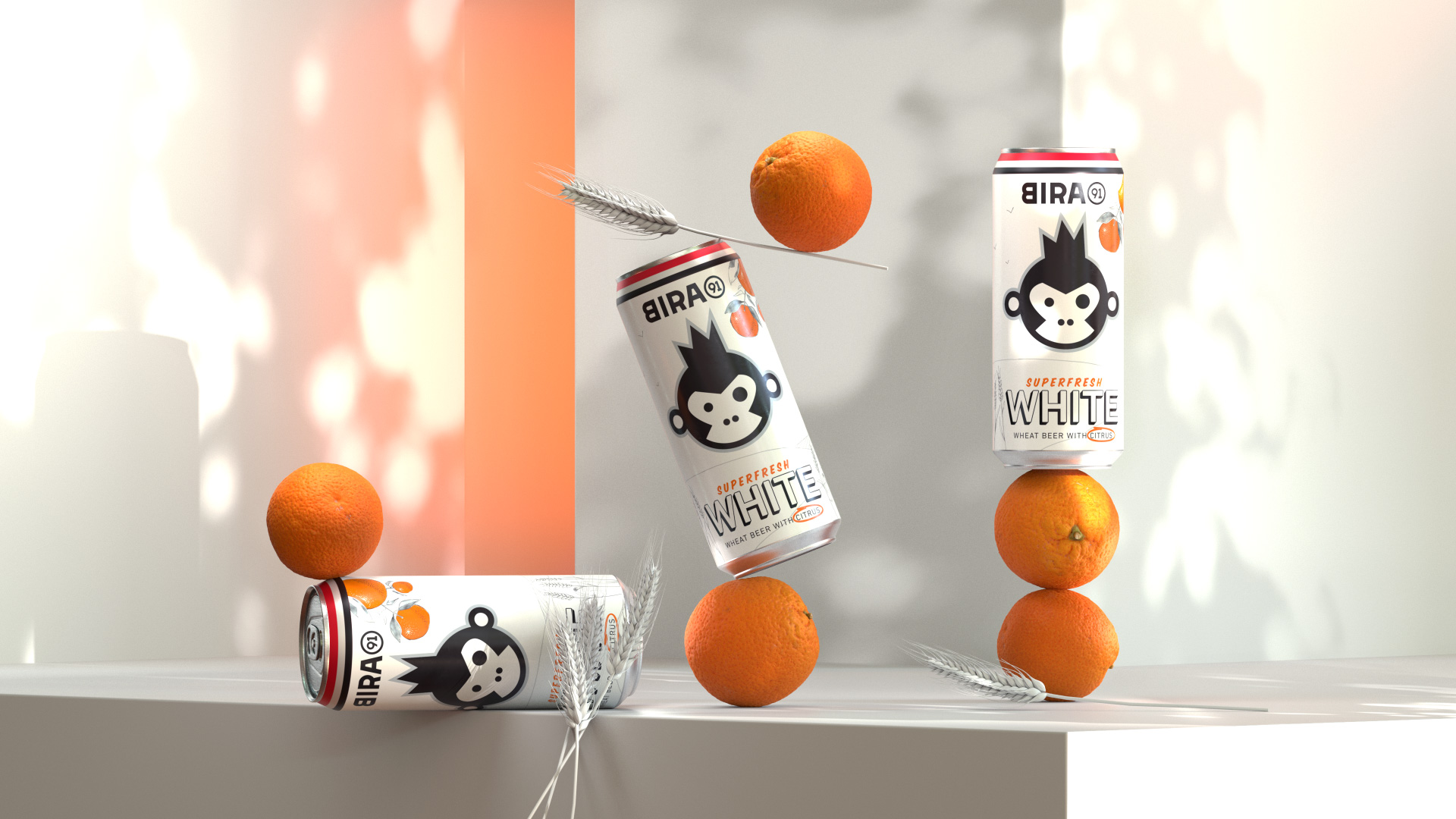
Our partnership with Bira 91 was focussed on identifying & articulating a distinct identity for the White product line, that could distinguish it from other products both in its own core portfolio and competitor brands, and also allow for a line of variants to be incorporated under the White product brand in the future.
This project is part of a series of engagements with Bira 91, to create new and re-align existing product identities for their core portfolio.
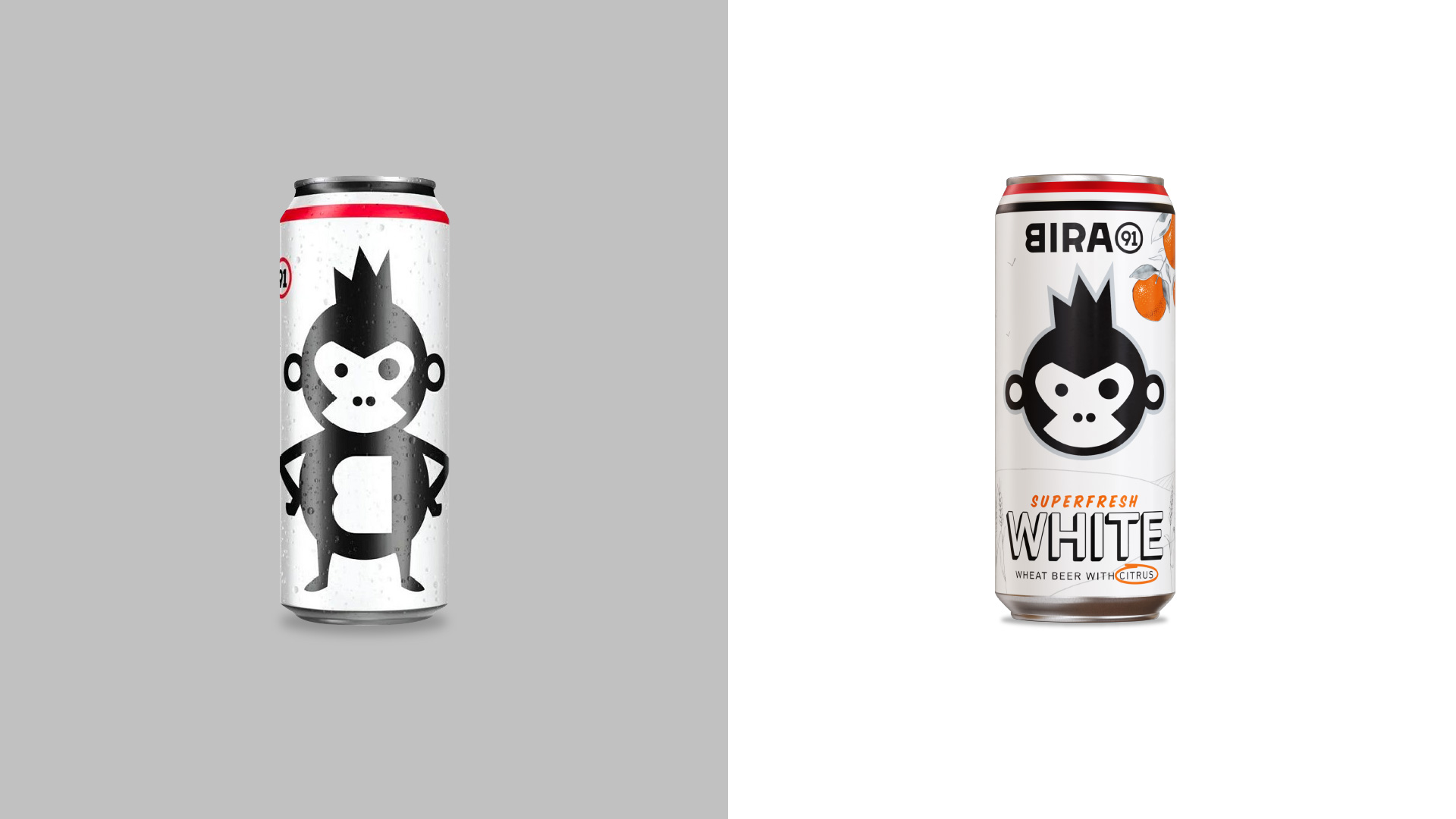
Product Positioning and Identity Refresh
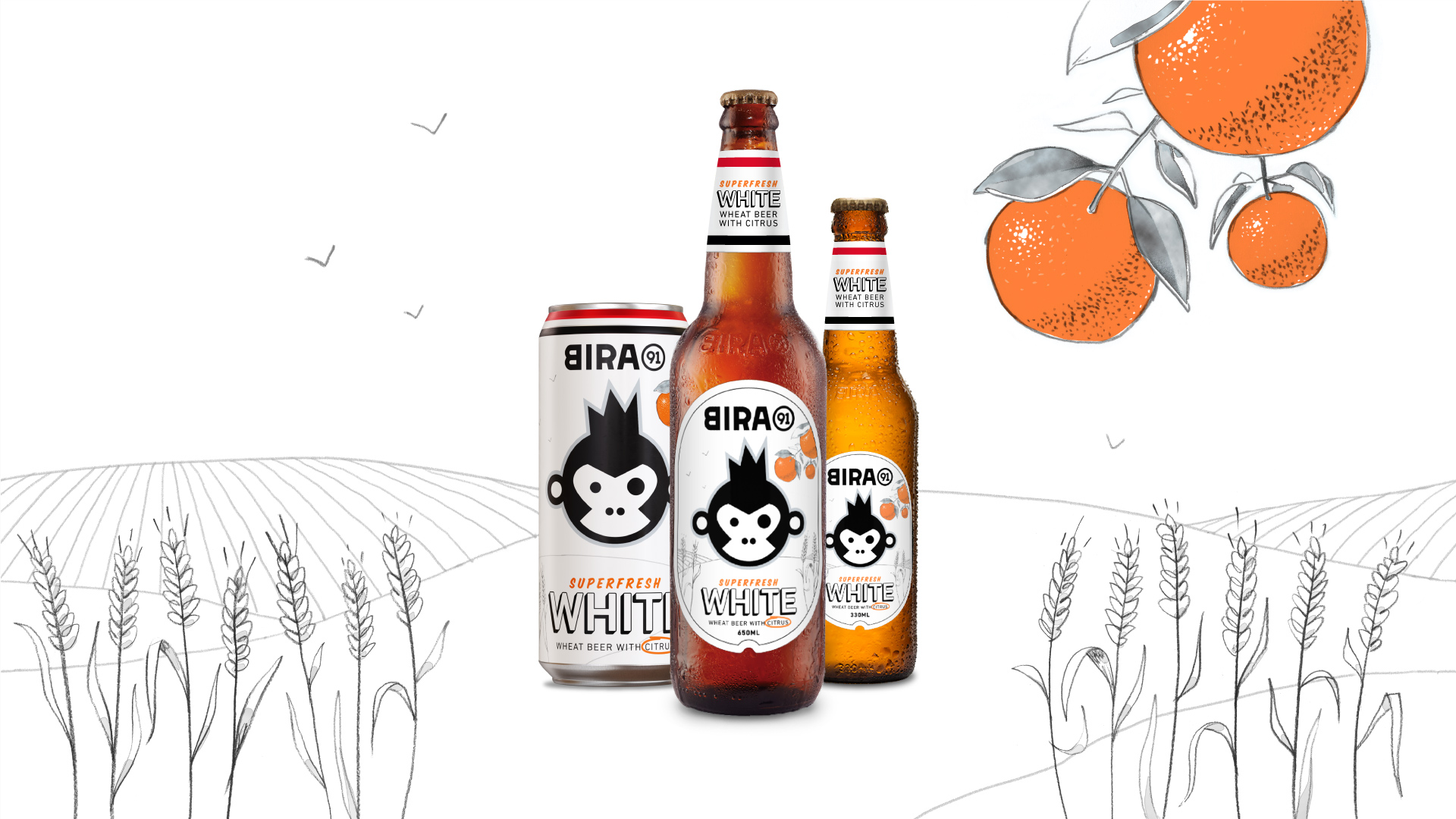
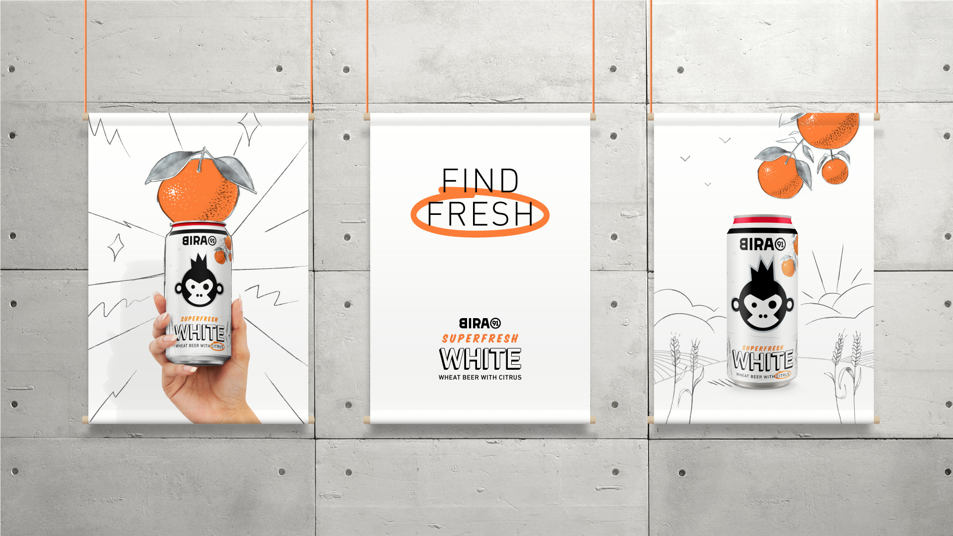
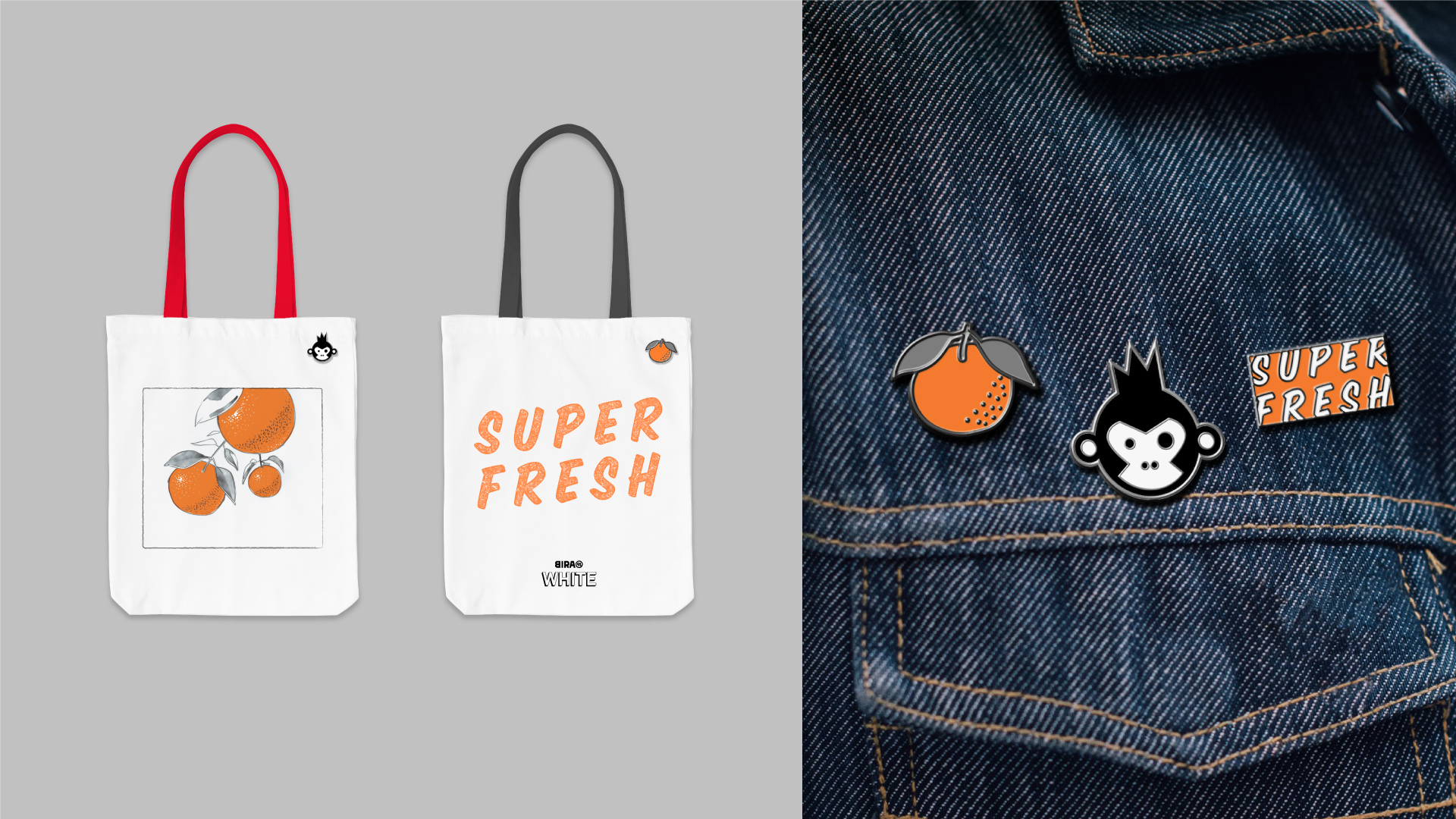
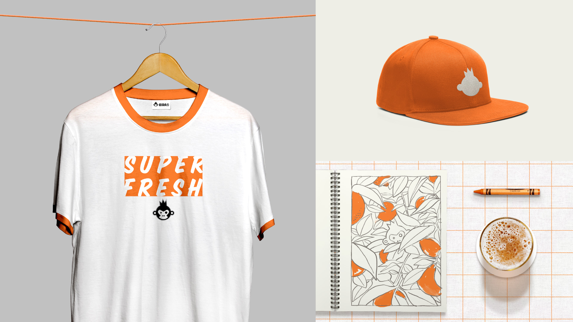
The new positioning for Bira 91 White celebrates its product strength of freshly brewed, flavourful beer. The idea of SUPERFRESH amplifies the promise of freshness, starting with the product and extending to the brand world through communication, image-making and strategic associations. Light & informal, both in visual and verbal tonality, the world of SUPERFRESH provides an open canvas for easy expressiveness.
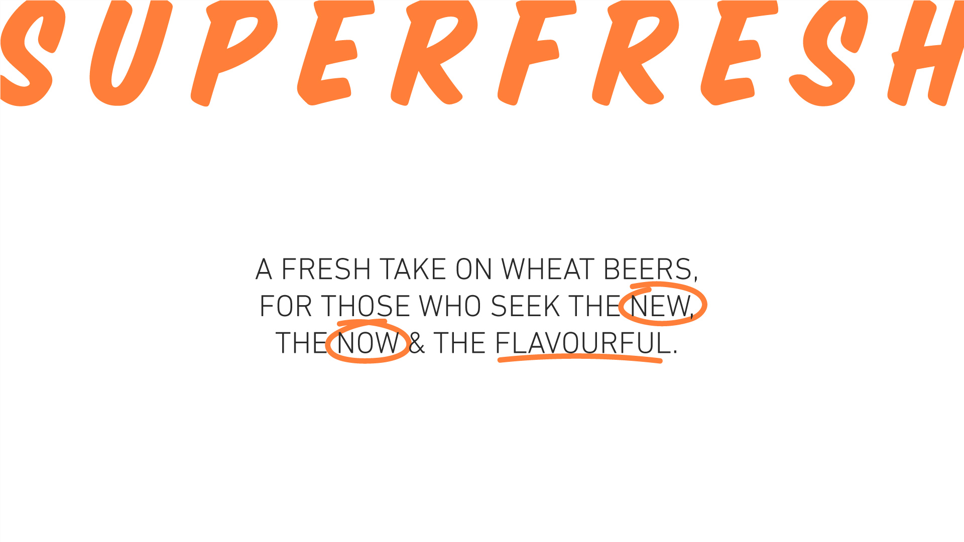
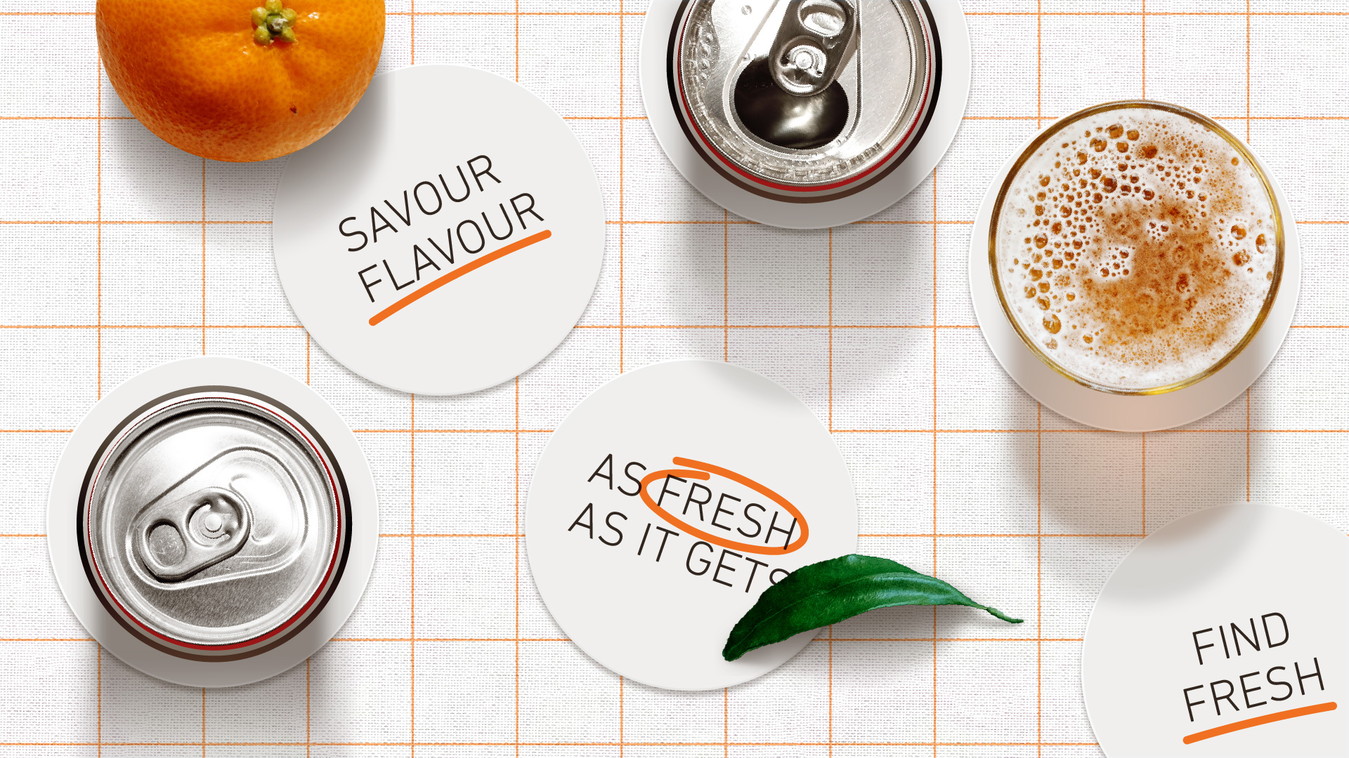
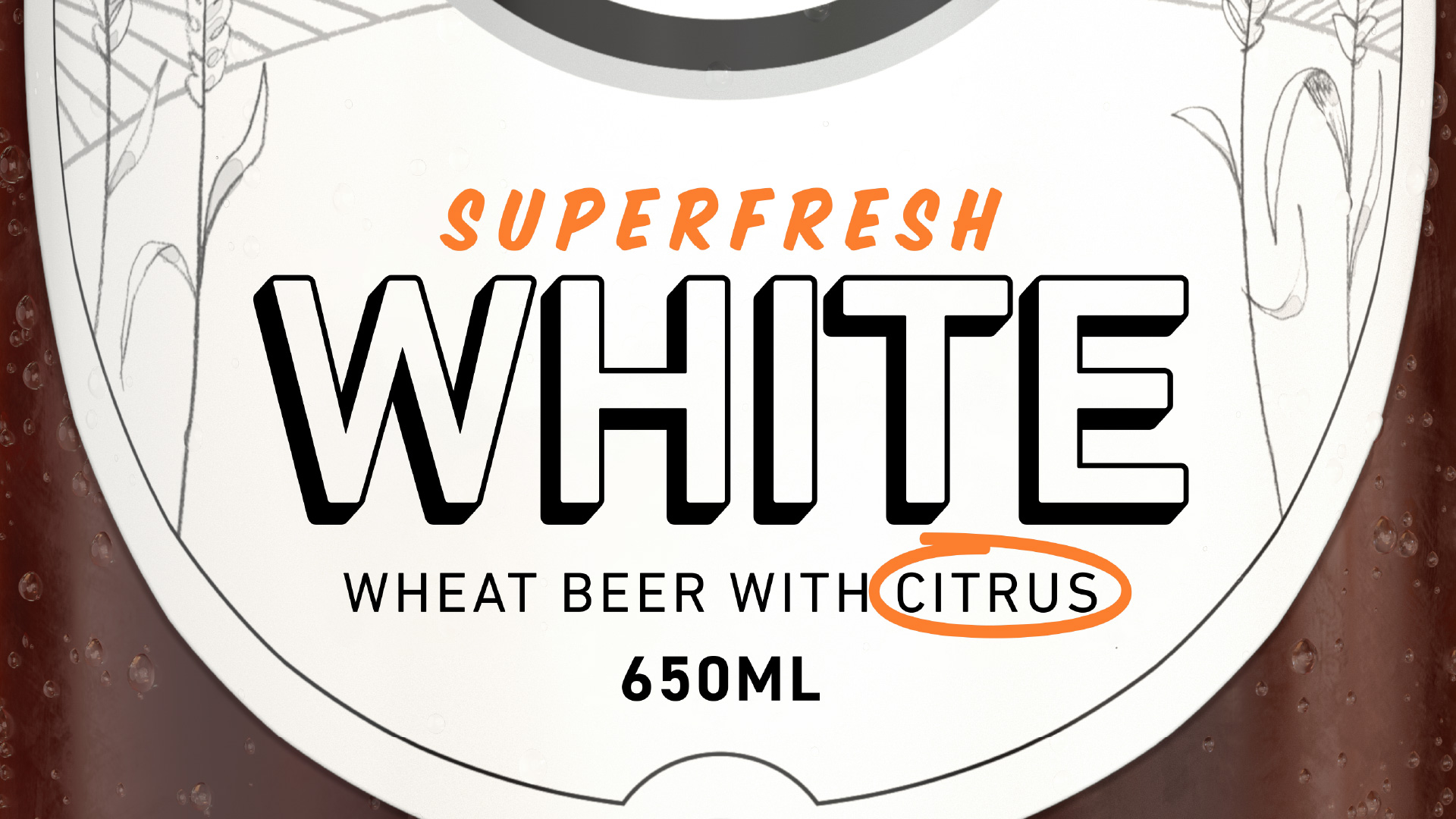
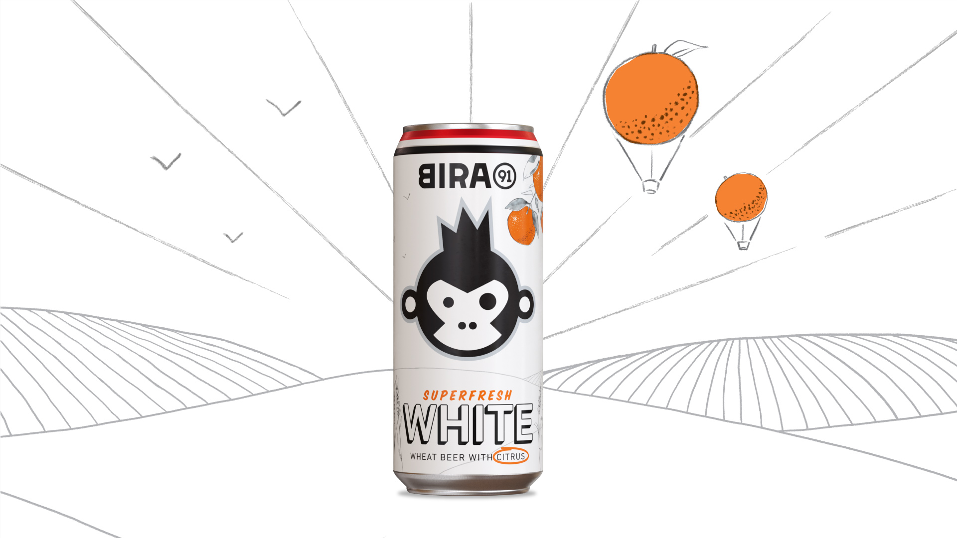
The reimagined packaging & design language accentuates the ‘whiteness’ building strong association with the product name. A subtle layer of hand drawn doodles allow for inclusion of contextual imagery that communicates product ingredients, while retaining the overall lightness and simplicity of design. Selective use of bright colour highlights the flavour-fullness and creates a system of adaptation for new flavour variants in the future. Typography retains use of the Din Next Pro font family used across Bira 91, in lighter weights to match the White aesthetic. Addition of marker-style accents in typography act as functional highlights while keeping it fun and easy.
Rajesh Dahiya, Siddharth Nair, Vishnu M Nair, Videet Desai, Mohor Ray, Ved Uttam