
Designed to Move

Tata Motors is India’s largest automotive brand with a diverse portfolio spanning infrastructure, commercial and passenger mobility solutions, and global presence in over 175 countries. We partnered with Tata Motors to create a holistic brand identity system, that expresses rejuvenated direction for the automotive giant.
The new brand design system unifies and brings alive the diverse world of Tata Motors as one strong mobility brand. It gives voice to the reinvigoration of one of India’s most trusted brands, and expresses its readiness today for mobility of the future with a fresh, bold language. The agile system adapts for content across diverse touchpoints and segments (passenger & commercial), while establishing bold recall for the Tata Motors.
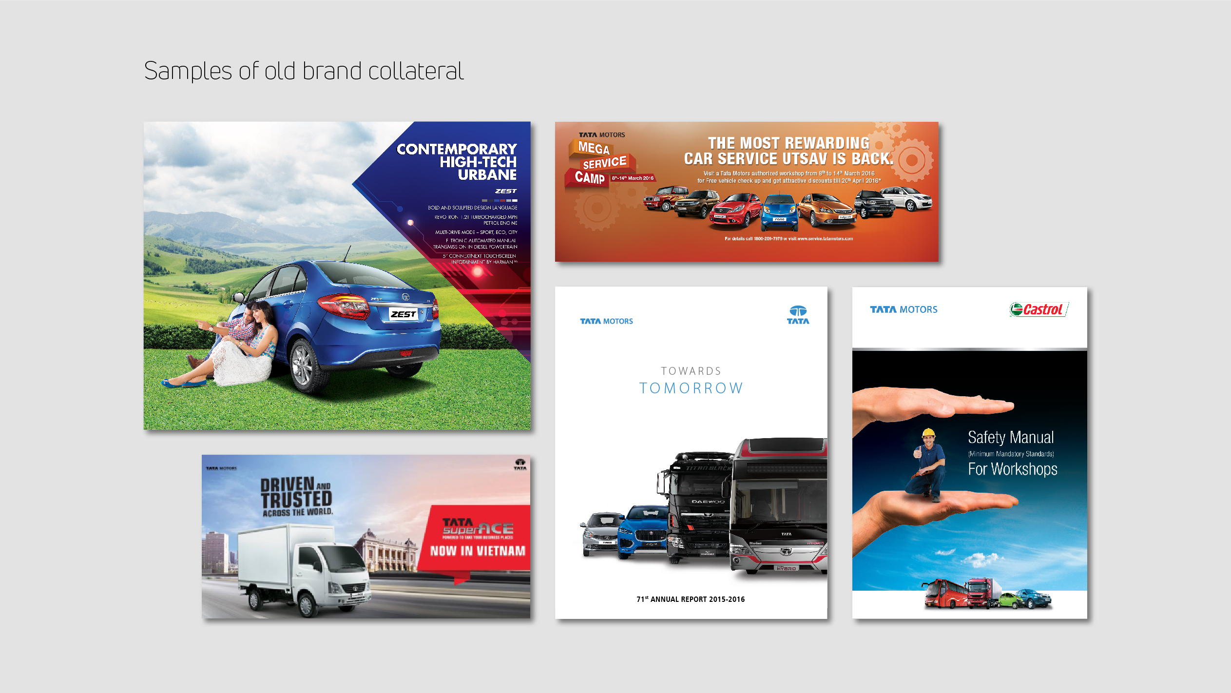
Samples of brand collateral before redesign.
In the absence of an identity system specific to Tata Motors, the brand relied on elements from the parent group branding programme—which were were limited in their relevance to the rapidly transforming world of mobility. Over the years, brand recall for Tata Motors was fragmented by diverse approaches in identity and design for different product brands. Notwithstanding significant developments in design & engineering in recent years, popular perception did not recognise the innovation and contemporary relevance of the Tata Motors brand. In short, the identity of the Tata Motors brand lacked clear distinction and direction, both of which were critical to express its collective power and potential in the mobility sector.
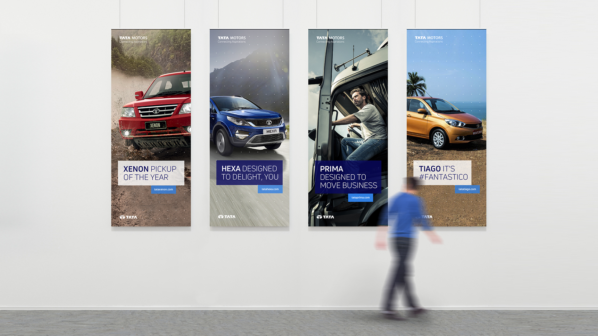
Snapshots from design system.
The new design language allows Tata Motors to express its collective strength as a mobility solutions provider, by providing an instantly recognizable and unified aesthetic that works across its diverse portfolio.
The design system draws its inspiration from the agile & seamless thinking for mobility of the future. It stands out from the commonly used heavy and masculine aesthetic of the automobile industry, by visualising the impact of solutions versus product stature. Agility drives the design aesthetic. It forms the foundation for a design language that is light, adaptable and responsive to content, and places the brand in a future-ready environment.
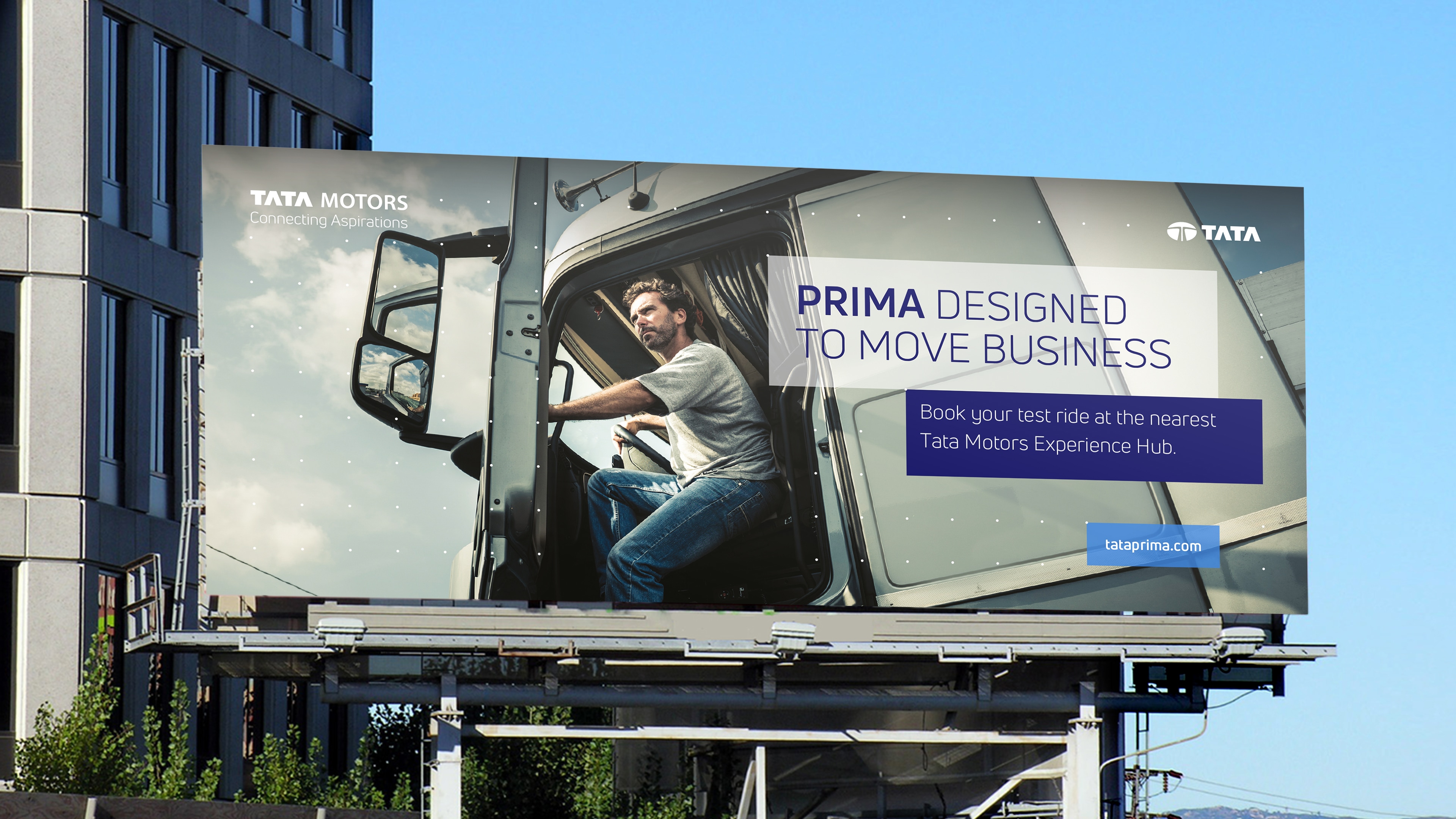
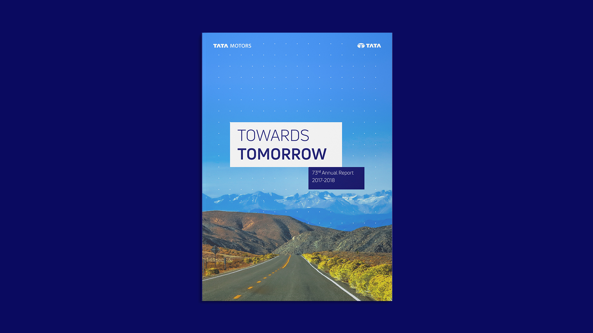
Recognising the rapidly changing landscape of channels for brand interaction, the design system was designed to seamlessly transition across media types with intelligent ease. Basic design principles were designed to provide smarter adaptation, that seamlessly adapt to different media and content formats. Core assets were defined as multi-sensorial elements with motion & sonic behaviour allowing consistently branded experiences across interactions.
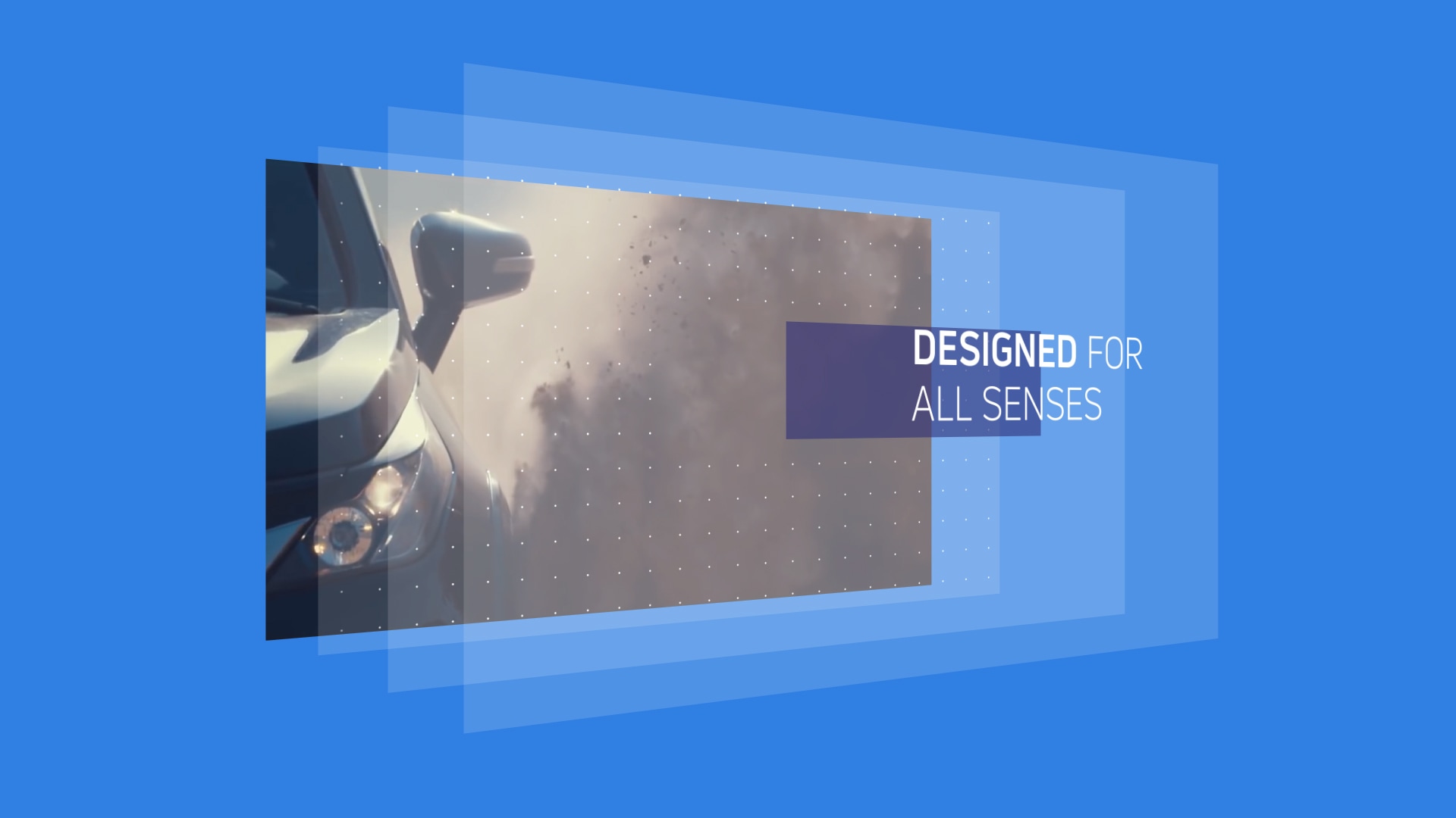
A layered design schematic.
Motion elements.
Brand master-track.
Building blocks of sonic identity.
The design system places content first, allowing evocative imagery/footage to take centre-stage, while characteristic containers carry primary messaging. This allows for expressiveness within the framework that is relevant to different markets & categories, without compromising on overall brand consistency. By approaching visual brand markers as functional content containers, the design system balances brand consistency & diversity, for impactful communication.

While there was a pressing need for Tata Motors to express its individuality, its connection to the parent group was integral to its identity.
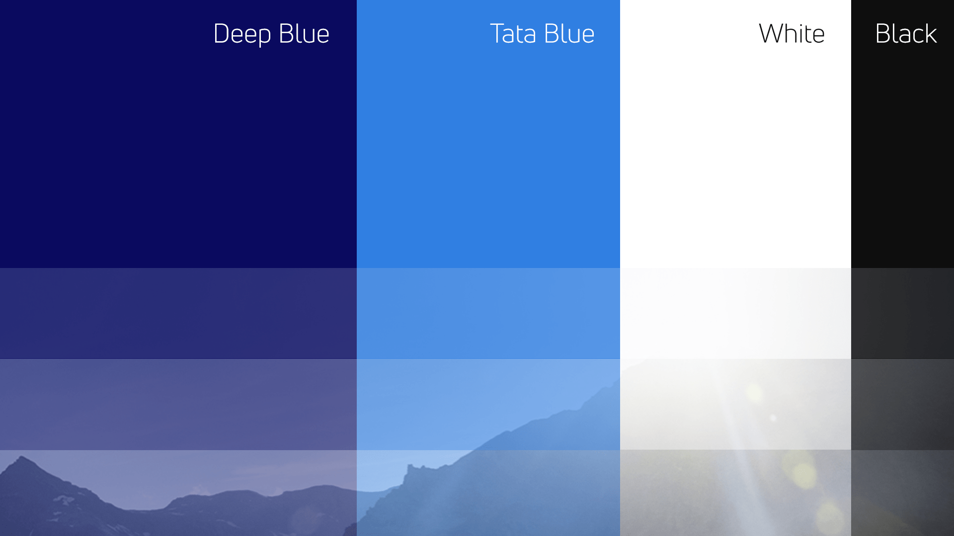
Retaining the connection with the iconic ‘Tata Blue’, the new design language expands the colour spectrum to include a new rich hue of indigo for Tata Motors, and builds vibrancy through the interplay of tints & transparent hues of the expanded palette. In doing so, the language builds a dynamic new expression for Tata Motors around its legacy colour—preserving the connection, but establishing its unique identity through the dynamic play within palette.
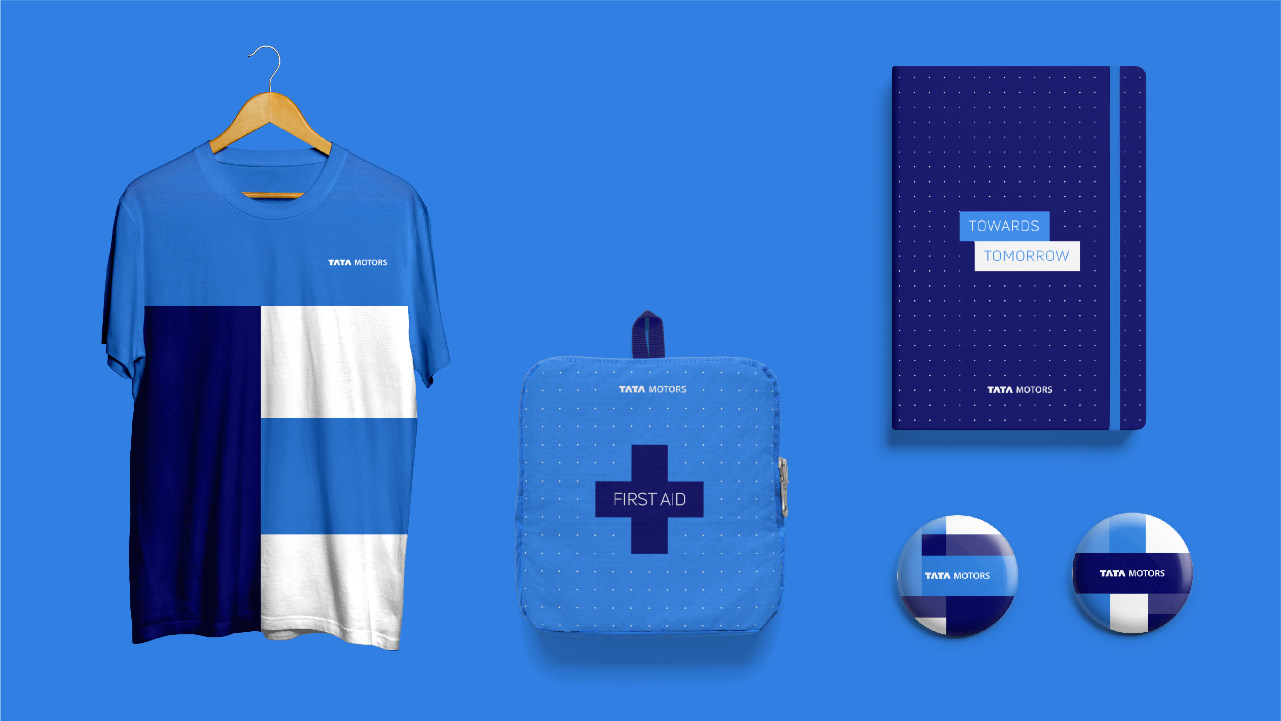
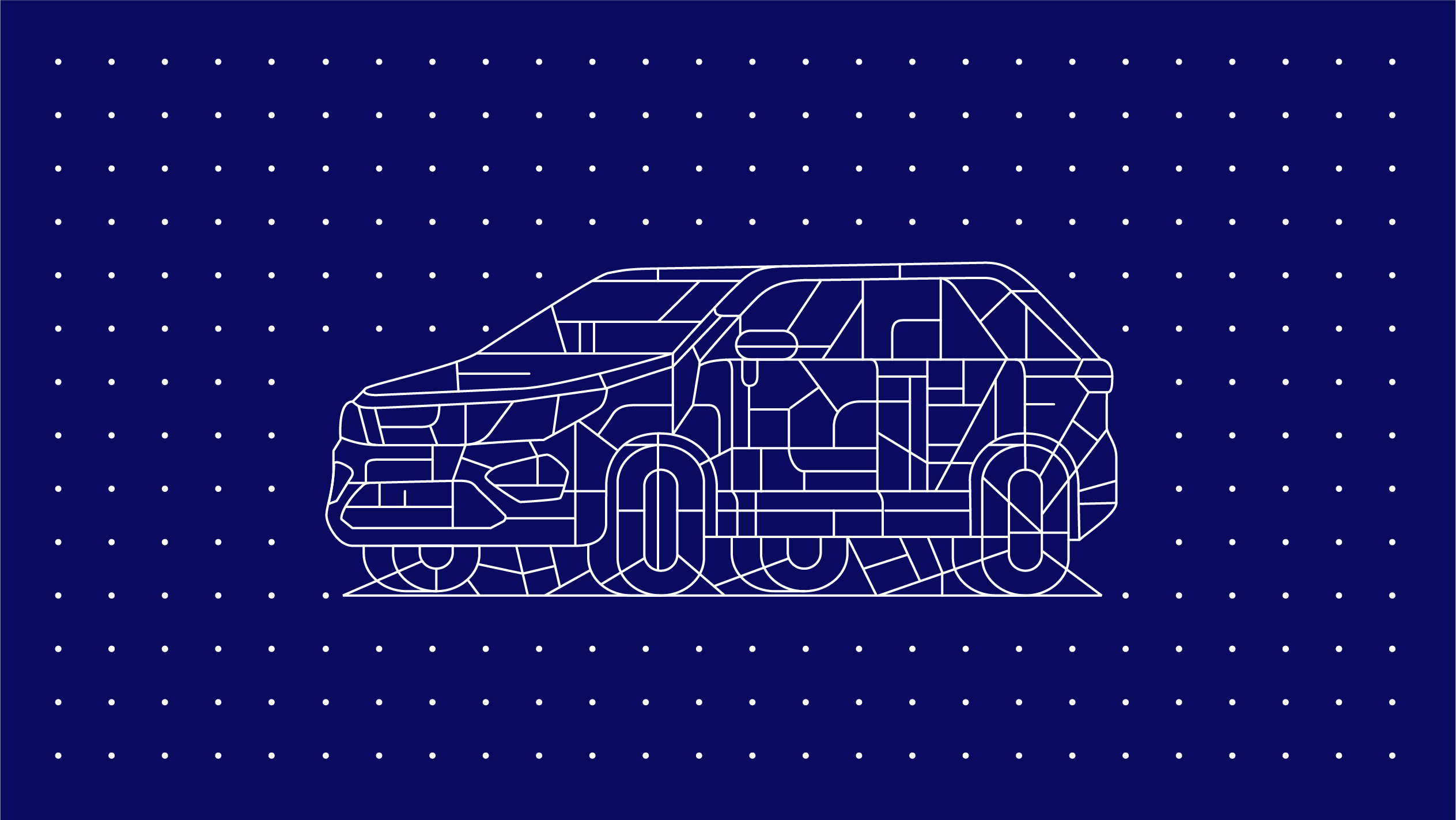
With its scale of operations, Tata Motors engages more than 60 agencies in India and across the world to deploy branded communication on a daily basis. We created an online Brand Hub to enable 60+ implementation & creative agencies across the corporate & product brands, to efficiently and consistently deploy the new identity system.
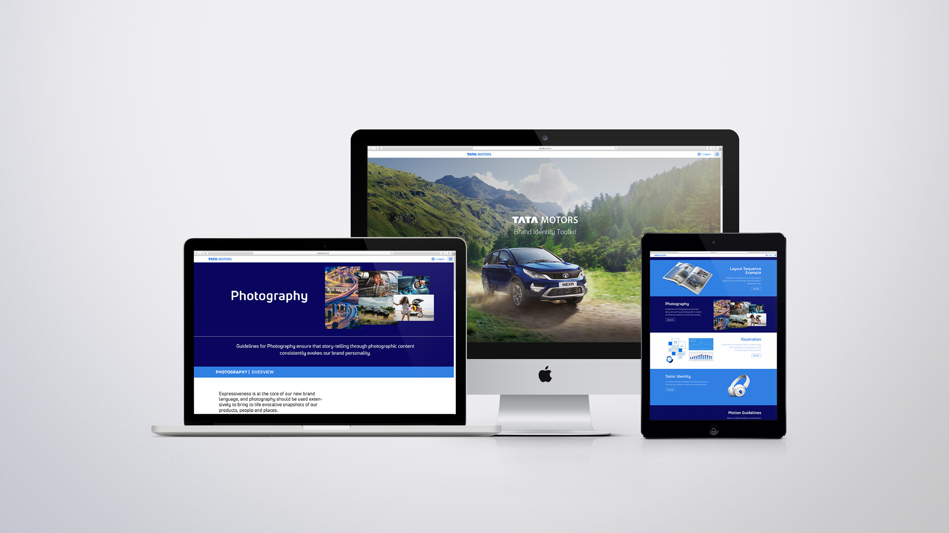
Brand hub for global deployment.