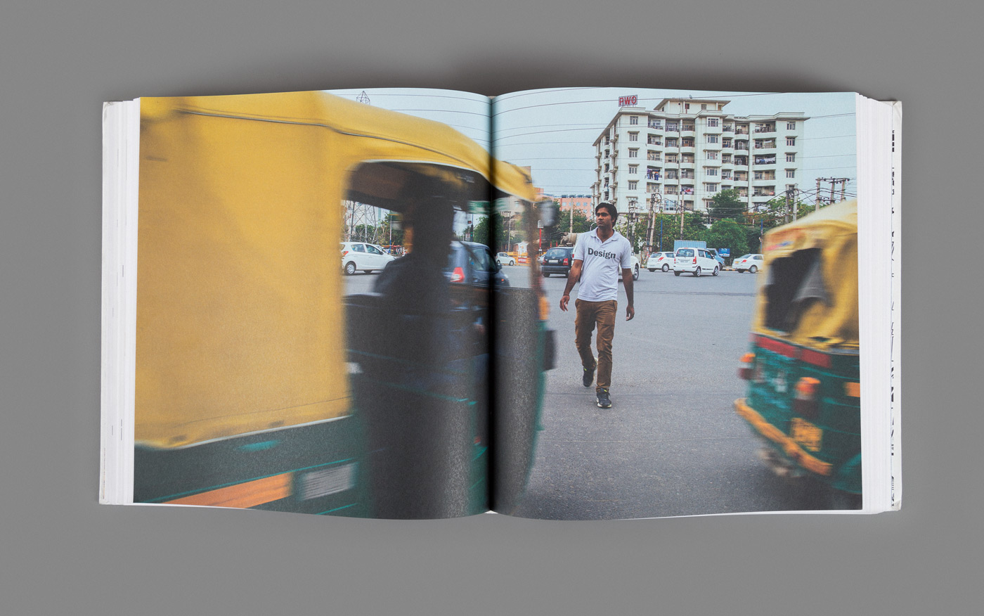
Opening spread of the Design section from the Annual.

Opening spread of the Design section from the Annual.
The D&AD Annual is the definitive guide to the very best in advertising and design from the year, featuring all the awarded work from the prestigious D&AD Professional Awards. For the 2014 edition of the D&AD Annual, D&AD commissioned 5 design practices from across the world to design different parts of the book, in an attempt to bring a truly global flavour to the compendium. Codesign was commissioned to design the opening spreads for the Design section of the Annual, which can be bought here.

Opening page, Book Design

Opening page, Graphic Design

Opening page, Spatial Design

Detail
There is a beautiful dichotomy in the canvas that we design in and for. There’s the ‘hidden’ framework of order that the designer works on. And there’s the ‘visible’, vibrantly chaotic frame within which design artefacts are eventually displayed and consumed. For the opening pages of the ‘Design’ section in this Annual, we wanted to bring the two together into one composition: distinct visuals of underlying structures, and the instances of usage/consumption from everyday life. The intent is twofold – a celebration of the beautiful contrast that is, in many ways, representative of everyday life in India; and a reminder to step out of our studios, into the ‘real’ world, to find inspiration.

Opening page, Branding

Opening page, Digital Design

Opening page, Packaging Design

Detail

Opening page, Product Design

Detail
“In my year as D&AD President, I’ve spent a lot of time exploring design communities and cultures all around the globe. I’ve not only unearthed so much incredible work, but I’ve learned about what design truly means in these places. Therefore, for my Annual, I knew it would be a wonderful platform to showcase a new wave of emerging design, which shakes off the shackles of the white, middle-class, western, male perspective, traditional in our industry. Bringing together five very different and distinctive artists, whilst creating a cohesive editorial design is a huge challenge, but I’m incredibly excited to see the final product.” Laura Jordan-Bambach, D&AD President. Press Release